WMWprob is identical to the area under the curve (AUC) when using a receiver operator characteristic (ROC) analysis to summarize sensitivity vs. specificity in diagnostic testing in medicine or signal detection in human perception research and other fields. Using the oft-used example of Hanley and McNeil (1982), we cover these analyses and concepts.
WMWprob is identical to the area under the curve (AUC) when using a receiver operator characteristic (ROC) analysis to summarize sensitivity vs. specificity in diagnostic testing in medicine or signal detection in human perception research and other fields. Using the oft-used example of Hanley and McNeil (1982), we cover these analyses and concepts.


Example 4. A Graphic to Visualize WMWprob Analyses
Here we create a graphic for the SuperHDL problem (Example 3) that is suitable for publication. We also show that the method handles datasets with hundreds of cases in each goup The graphics functions
PlotDirector(), FitterJitter(), and Toothpics() are downloadable as a single R file.
In his seminal book "The Visual Display of Quantitative Information," Edward Tufte implored us to "Show the Data" by plotting the individual values in a way that encourages honest visual inference. Such graphics should also be tuned to agree with the statistical methods applied to the data. For example, if the fitted statistical model is log(Y) = beta0 + beta1*X + e, the appropriated scatter (X,Y) scatterplot would use linear scaling on the X axis and log scaling on the Y axis, but keeping the tick labeling in X and Y units. Thus, equidistant ticks on X might be 10, 20, 30, 40, but equidistant ticks on Y might be 4, 8, 16, 32, 64; or 10, 100, 1000, 10000.
Example 4a. A Plot for the SuperHDL Study
This continues the WMWprob analysis of Example 3.
The list returned by WMW() contains $Qscore,
Qscore = rank(Y, ties.method="average") – 0.50)/N.
For example, in the SuperHDL faux dataset, Y = PAVchange is the five-week change in percent atheroma volume for all N = 47 patients. Two cases, #30 and #31, happen to be tied at the median of –0.60, producing an average rank of (23 + 24)/2 = 23.50 for each. Their Qscores are (23.50 – 0.50)/47 = 0.489. The minimum of –10.00 and maximum of 4.50 produce Qscores of 0.011 and 0.989, respectively.
================================================================
Case # PAVchange Rank Qscore Comment
...... ......... .... ...... .........................
12 –10.00 1.0 0.011 best outcome in study
30 –0.60 23.5 0.489 tied score at median
31 –0.60 23.5 0.489 tied score at median
47 4.50 47.0 0.989 worst outcome in study
================================================================
The Qscore rank transformation re-scales the Y values to make the two sample means congruent with the WMWprob estimate. Let Qscore1 and Qscore2 be the subsets of the Qscore values corresponding to Y1 and Y2. Then
WMWprob = mean(Qscore1) – mean(Qscore2) + 0.50.
Jittering
Tied or nearly tied Qscore values in the same group should be jittered sufficiently—but minimally—to show each one when plotted. Other values should be left unchanged. The group means of the jittered observations should be the same as the original. The deterministic algorithm in FitterJitter() does this.
Qscore.jit <- FitterJitter(Y=Qscore, Groups=treatment)$y.jit
On the other hand, using built-in R function, i.e. jitter.Qscore <- jitter(Qscore), simply adds a random tab of noise to each value, whether it needs it or not.
====================================================================================
Case # Treament Qscore Qscore.jit How Jittered jitter(Qscore)
...... ........ .......... .......... ............... ..............
12 SuperHDL 0.01063830 0.01063830 not needed 0.01024257
30 SuperHDL 0.48936170 0.48617021 Q – 0.003191489 0.48636923
31 SuperHDL 0.48936170 0.49255319 Q + 0.003191489 0.49328815
47 SuperHDL 0.96808511 0.96808511 not needed 0.96582124
====================================================================================
The Toothpics Plot
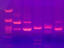
DNA gel electrophoresis
Toothpics() was inspired by images obtained from gel electrophoreses of nucleic acids, DNA, RNA, etc.
Click on image or the PDF icon to expand the plot in a new tab or window.
Here, each of the 47 Qscores, even those tied (but now jittered) is discernible. The visual
inference shows no support for concluding that SuperHDL was (quoting ABC News anchor Peter Jennings) "a real breakthrough in treating heart disease." In fact, the plot quickly reveals that (for these faux data) the second best change in percent atheroma volume was in the placebo group.

Toothpics plot of SuperHDL data.
Note that the Y-axis terminates at the minimum and maximum values, creating what Tufte termed a range-frame axis. (Because
Qscores of 0.00 and 1.00 are impossible, why have such marks and labels on the axis?) The signage of "better" and "worse" was added to remind the view how PAVchange and, thus, Qscore are polarized.
Creating the Dataset
The data needed here are created in Example 3. The Group variable is treatment and the Y variable is Ex3$Qscore.
What Size and Where to Build the Plot
Though not necessary, PlotDirector() facilitates setting the next plot's size and whether to display it in a separate graphics window (The Plots pane in Rstudio is limited.), or build a pdf, .png, .svg, or .jpg file in a given folder with a specific filename. To create a 6-inch by 6-inch plot in a separate window, use:
PlotDirector(PLotSize=list(h=6, w=6), CloseOld=TRUE)
In MacOS, to build and save a .pdf file, use something like
current.wd <- getwd()
dir <- "/Users/ralphobrien/projects/SuperHDL/plots"
PlotDirector(PlotSize=list(h=6, w=6),PlotType=".pdf",
Directory=dir,Filename="WMWEx4aPlot")
In Windows, you might use something like dir <- "C:\user\projects\SuperHDL\plots". Unix/Linux users will know what to do. PlotDirector() responds:
The .pdf file for this plot will be placed in:
/Users/ralphobrien/projects/SuperHDL/plots
IMPORTANT: After creating your .pdf file, run
dev.off()
to close it.
ALSO: PlotDirector() has reset your working directory to
/Users/ralphobrienCWRU_MBPro07/downloads
After plotting, to reset it as it was, enter
setwd("/Users/ralphobrienCWRU_MBPro07")
Creating the Toothpics Plot
Toothpics() is documented elsewhere, but except for the RelFontSize argument, is straightforward to decipher.
QmeanP.ch <- formatC(mean(QscoreP),digits=3,format="f")
QmeanSHDL.ch <- formatC(mean(QscoreSHDL),digits=3,format="f")
WMWprob.ch <- formatC(Ex3a$WMWprob,digits=3, format="f")
SE.WMWprob.ch <- formatC(Ex3a$SE.WMWprob,digits=3, format="f")
title <- paste("Visualizing a WMWprob Analysis\nWMWprob = ",
QmeanP.ch, " - ", QmeanSHDL.ch, " + 0.50 = ", WMWprob.ch, "\n",
"SE[WMWprob] = ", SE.WMWprob.ch, sep="")
Toothpics(Title=title, Y=Qscore.jit, Group=treatment, GroupLabel="Treatment",
GroupLevels=c("Placebo", "SuperHDL"),
YLabel="Q-score, Change in Plaque Burden",
PlotMeanCIs=NA, Quantiles=NA,
RelFontSize=c(1,1,1,1,1,1.5), MeanColor="black")
text(0.40, 0.90,"worse", pos=4, cex=0.7,srt=90)
text(0.40, 0.03,"better", pos=4, cex=0.7,srt=90)
dev.off() # Completes and closes graphics file, making it usable.
setwd(current.wd) # Restores the working directory to what it was.
The graphics file (here, a .pdf) appears in the directory specified, and the working directory is reset to what it was.
Example 4b. A Qscore Toothpics() plot with nearly 400 cases per group.
With intelligent jittering, Toothpics() plots can effectively display the density of hundreds of observations.
Storyline (100% science fiction)
Kalexie O'Keil, PhD, and her colleagues have run a randomized clinical trial to assess how much, if any, WMK-19 raises margotase levels in patients who have marked deficiencies in this digestive enzyme. 378 subjects received WMK-19 and 385 received placebo for 30 days and were then measured on serum margotase (mg/dL). For practical and financial reasons, there was no baseline measure .
True State of Nature (What Only Mother Nature Knows)
While the O'Keil team must use the Scientific Method to address the research question, Mother Nature knows the exact answer. For Placebo subjects, margotase is Normally distributed with a mean of 40 and standard deviation of 7. For the WMK-19 subjects, 75% do not respond, so their margotase levels are also distributed Normal(40, 7). But the other 25% respond beautifully with margotase levels distributed Normal(61, 7), a three standard deviation improvement. Using WMW methodology to compare WMK-19 to placebo, this "true state of nature" has WMWprob = 0.62 and WMWodds = 1.64.
Data Generation and WMW() Analysis
Data Generation and WMW() Analysis
mixrate <- 0.25
delta <- 3
tWMWprob <- mixrate*(1-pnorm(0, delta, sqrt(2))) + (1-mixrate)*0.50
tWMWodds <- tWMWprob/(1-tWMWprob)
cat("\nTrue WMWprob and WMWodds:", tWMWprob, tWMWodds)
n <- c(378, 385)
set.seed(123)
n1.r <- rbinom(1,n[1],mixrate)
Z1 <- c(rnorm(n1.r,delta,1), rnorm(n[1]-n1.r,0,1))
Z2 <- rnorm(n[2],0,1)
margotase <- round(40 + 7*c(Z1,Z2),1)
treatment <- rep(c("WMK-19","Placebo"),n)
Ex4b1 <- WMW(Y=margotase, Group=treatment,
GroupLevel=c("WMK-19","Placebo"),
Alpha=c(0.025,0.025))
This WMW() analysis gives the WMWprob estimate and balanced 95% confidence interval of 0.61 [0.57, 0.65].
**********************************************************
Stochastic Superiority # of Pairs Probability
...................... .......... ...........
{WMK-19} > {Placebo} 88737 0.610
{WMK-19} = {Placebo} 484 0.003
{WMK-19} < {Placebo} 56309 0.387
Total: 145530 1.000
WMWprob = (88737 + 484/2)/145530 = 0.611
WMWodds = 0.611/(1 - 0.611) = 1.573
**********************************************************
************************************
Parameter Estimate 0.95 CI*
....................................
WMWprob 0.611 [0.571, 0.651]
WMWodds 1.573 [1.329, 1.863]
************************************
*CI error rates (alphaL, alphaU): (0.025, 0.025)
CI Method: coupling Sen (1967) & Mee (1990)
Plotting Margotase Values
After using PlotDirector() or some comparable code to specify the size and destination of the plot (see above), we use FitterJitter() and Toothpics() to display all values of margotase.
After using PlotDirector() or some comparable code to specify the size and destination of the plot (see above), we use FitterJitter() and Toothpics() to display all values of margotase.
y.jit <- FitterJitter(Y=margotase, Groups=treatment)$y.jit
Toothpics(Title="Does WMK-19 Increase Serum Margotase?",
Y=y.jit, Group=treatment, GroupLabel="Treatment",
GroupLevels=c("WMK-19","Placebo"),
GroupNames=c("WMK-19 (n = 378)", "Placebo (n = 385)"),
YLabel="Margotase (mg/dL)",
RelFontSize=c(0.85,1,1,1,1,1.5), MeanColor="black")
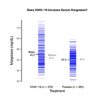
Toothpics() plot of margotase values.
Plotting the margotase values is congruent with, say, using a Welch-type t-test to assess mean(Y1) - mean(Y2). To visually analyze the data in a metric congruent with using the WMW methodology, which assesses Prob[Y1 > Y2] + Prob[Y1 = Y2]/2, we need to plot the Qscores.
Of course, the plots lead to the same visual inference: WMK-19 produces some increase in margotase. However, the discerning viewer sees that the clear majority of WMK-19 values look the same as the Placebo values. The difference comes at the top end, which is dominated completely by WMK-19 values. Such patients are "WMK-19 responders," and Dr. O'Keil might then focus on how they differ (genetically?) from the non-responders. Focusing only on WMWprob estimated at 0.61, 95% CI of [0.57, 0.65], would be short-sighted. As Tufte stressed, one needs to See the Data!
QmeanY1.ch <- formatC(mean(QscoreY1),digits=3,format="f")
QmeanY2.ch <- formatC(mean(QscoreY2),digits=3,format="f")
WMWprob.ch <- formatC(Ex4b$WMWprob,digits=3, format="f")
SE.WMWprob.ch <- formatC(Ex4b$SE.WMWprob,digits=3,
format="f")
title <- paste("Does WMK-19 Increase ",
"Serum Margotase?\n\nWMWprob = ",
QmeanY1.ch, " - ", QmeanY2.ch, " + 0.50 = ",
WMWprob.ch, "\n",
"SE[WMWprob] = ", SE.WMWprob.ch, sep="")
Toothpics(Title=title, Y=Qscore.jit, Group=treatment,
GroupLabel="Treatment",
GroupLevels=c("WMK-19","Placebo"),
GroupNames=c("WMK-19 (n = 378)", "Placebo (n = 385)"),
YLabel="Q-score, Margotase",
PlotMeanCIs=NA, Quantiles=NA,
RelFontSize=c(0.85,1,1,1,1,1.5),
MeanColor="black")

Toothpics() plot of Qscores.